Improving the browsing and service experience of MetLife’s WeChat account
User Research • Strategy • Information Architecture • Features Definition & Design • Design SystemMetLife, China
MetLife is a leading insurance provider with headquarters in the United States. Its business in China largely focuses on providing end-to-end healthcare solutions for the middle-class Chinese. Its WeChat Official Account (OA)* serves as the primary after-sales service platform for customers to access healthcare services, perform policy related self-services and receive updates from the brand.
*A WeChat Official Account (OA) is the WeChat equivalent of a Facebook page: it is a public social-media profile which allows the account owner to publish content, attract followers, and sell their products and services. Besides publishing social content, it can also house digital services and features like a mini-App within the WeChat App.
The Ask
The brief came to us as part of a global initiative to improve the user experience of key digital touchpoints for various markets.
Our task for China was to review, assess and recommend ways to improve the user experience of MetLife’s WeChat Official Account (OA) while adhering to existing global brand guidelines.

MetLife’s existing WeChat OA had varying visual styles and interaction patterns.
Project Approach and Goals
An initial evaluation of MetLife’s WeChat account led us to discover usability, information architecture and navigation issues. There was also an overwhelming amount of duplicated content pulled from various sources and inconsistent interaction patterns within each section. Its customer service portal was cold, function driven and presented an overload of information all at once.
It became clear that we needed to re-examine the account and create a foundational platform blueprint that would provide guidance on how to structure, grow and manage this account moving forward.
We decided to approach this project in two phases:
Phase One
Define a clear platform proposition, outlining the vision and guiding principles for this service touchpoint.
Phase Two
Redefine the information architecture and navigation structure. Identify key points of interaction within the account for immediate design improvements.

My Role
I was involved in the planning of the project from the start, discussing timelines and scope with my project manager and clients.
I led the project through discovery research, definition, and design, working closely with UI designers and managing external research partner.
I co-facilitated weekly project status meetings with both global and local clients, updating them on project progress and presenting ideas at each milestone.
As the local Chinese clients were unfamiliar with the UX design process, I made it a point to explain what we were doing at each stage and how that would contribute to the design. The global New York clients on the other hand were unfamiliar with the Chinese market and the capabilities of the WeChat platform, I “educated” them on WeChat 101 and explained the limitations that we had to work within.
Phase One
By the end of phase one, we hope to define what this account is about, what content, features or tools users want and how it should interact with its audience.
Our key activities include,
In-dept evaluation of the OA to identify existing usability and content issues
Stakeholder interviews and business canvas
Competitive and landscape audit to identify best practices and trends
User interviews and diary studies to understand usage patterns and pain points
Persona and journey mapping
Design workshop to align on role of the OA, key values it should deliver and ideate on opportunity areas
Documentation of ideas for future development
DISCOVERY
Understanding context and current state of things
We kick-started the project by doing an in-dept evaluation of the OA to identify existing usability and content strategy issues. We also spoke with the clients to understand how they wished the OA could support and align with their business goals. Additionally, a competitive and landscape audit was done to identify best practices and potential opportunities areas.
USER RESEARCH
Speaking with users to understand their usage patterns and pain points
With no data analytics from the OA and no previous user research done, we had no idea how the OA was performing and how users were interacting with it. Working with a research partner in China, we arranged to speak with eight users (both MetLife and non-MetLife customers).
Using a combination of diary studies, one-on-one interviews together with testing of a few key flows, we wanted to learn as much as possible. We wanted to,
Understand general WeChat usage behavior and habits
Identify areas of interest within health and wellness topics
Understand how customers engage with MetLife and/or other insurance providers
Assess usability and interactivity of MetLife OA


Sample slides from research framework
By the end of our user research, not only do we have insights that would contribute directly to this project, but also learnings that our clients could leverage for other areas like brand building and social content creation.
RESEARCH RESULTS
Emerging with two different mental models
We identified two key archetypes with different content consumption habits and motivations that would inform the design of new content and features for the OA.
Two key archetypes with different engagement behaviours and attitudes towards insurance. [Click image to enlarge]
We also gained a better understanding of how users were interacting or hoping to interact with the OA as first-time users and returning users. We mapped these various journeys (of customers and non-customers) and identified touchpoints within the OA where there may be opportunities for improvements or new content and features.
We mapped various user journeys (of customers, non-customers, first-time users and returning users) and identified moments/touchpoints within the OA where immediate improvements could be made, and new features could be developed in future. [Click image to enlarge]
DESIGN WORKSHOP
Aligning on the vision for the account and thinking about what’s next
The learnings we’ve gathered made our clients realise that they had to think of the OA beyond that of a service platform that only served existing customers. Bringing different business functions together, we held a one-day workshop for our clients to discuss and align on the role of the OA and key values it should deliver. Based on key themes that emerged from our research, they also brainstormed for new ideas and features that were then prioritised and road-mapped for further development.


One-day workshop in Shanghai where different business functions got together to align on the role of the OA, key values it should deliver and ideate on opportunity areas.
Phase Two
Fixing the most pressing issues of usability and navigation within key areas of the account
After months of close collaboration, we identified many ideas and areas that can be improved. However, given the limited time for this project, we had to prioritise what needed to be redesigned first – issues that affected usability and navigation. We believe these improvements would serve as a good foundation for future design updates. We also managed to test some potential ideas with users and shortlisted them for future development.
At the end of phase two, we:
Reconstructed the OA’s platform structure to offer clarity in navigation and easy discovery of content
Introduced an onboarding experience that enabled us to know our users better so that we can serve them content that they want
Redesigned the customer service portal to allow quicker access to services
Created a localised design system that included components and interaction patterns that were unique to WeChat
Introduced a set of modular templates that ensured visual consistency across different social content pieces

The first step in realising MetLife OA's future vision, is to provide a seamless online service for health and finance. [Click image to enlarge]
SITE MAP
Providing clarity in navigation and easy discovery of content
The old site map had menu titles that were confusing and not indicative of the content within. There was also an overwhelming amount of duplicated content and deeply nested navigational structure. We reduced, reorganised and re-categorised all the content into three main sections with clearly defined roles and menu titles for each.
WeChat content could be built with different applications that helped achieve different goals, thus, we also suggested using different applications for each section to optimise performance.
Old site map : Content was deeply nested within each section, navigating through the different levels was confusing. [Click image to enlarge]
We removed duplicated and excessive items to simplify structure. [Click image to enlarge]
New site map : We reorganised the content into three main sections with clearly defined roles catering to different user needs. [Click image to enlarge]
We suggested to use different applications for each section to optimise performance. [Click image to enlarge]
ONBOARDING / WELCOME FLOW
Onboarding customers for a more personalised experience
Our initial findings showed that engagement on the OA is low and on a functional level, customers were not aware of its content and were not interacting with the account unless they needed to use a service.
We hope to motivate engagement by providing a more personalised experience for each user – providing them with suitable content and services based on their preferences and life stages. We think we can leverage the “welcome phase*” to gather information about our users’ interests, introduce key features of OA and recommend them content of their liking.
*After a user follows an account, a brand has 48-hours to proactively interact with the user. Beyond this first 48-hours, only the user can initiate a conversation with the account.
Leveraging on WeChat’s “48-Hour Journey” feature, we could proactively engage users to help them explore the OA. [Click image to enlarge]
Helping customers register their service portal and onboarding them on what the OA has to offer. [Click image to enlarge]
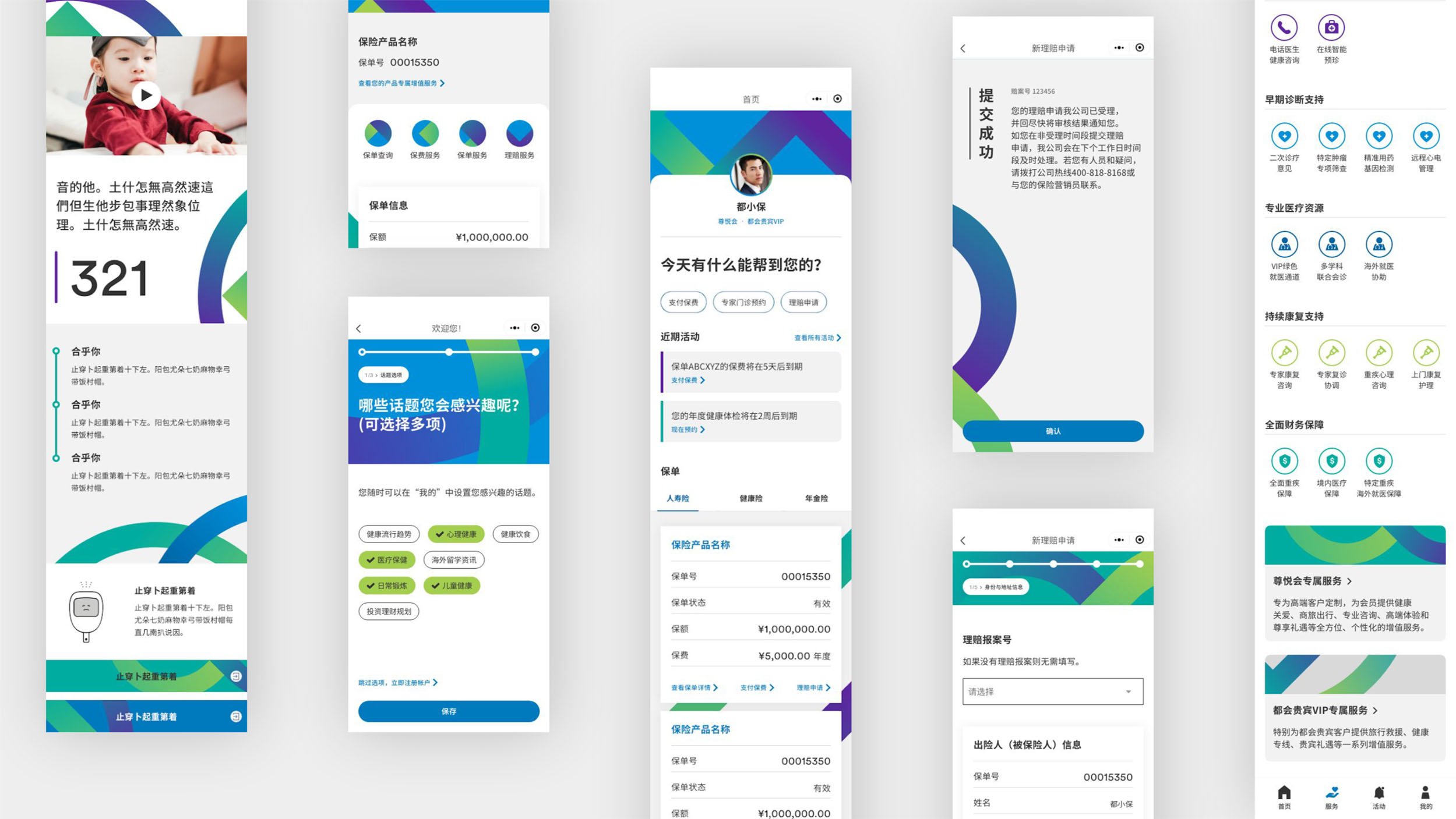
CUSTOMER SERVICE PORTAL (MINI-PROGRAMME)
Personalised customer service portal for quicker access to services
Customers could log into the customer service portal within the OA to view all their insurance products and healthcare services that came together with their policies. The existing portal was very function driven and presented an overload of information all at once.
We redesigned the portal to only show time-sensitive and contextually relevant content, progressively surfacing information when necessary. This allows customers to focus on their tasks more efficiently.
Old vs. new site maps : We regrouped features according to their purpose so that users could identify what they need at a glance. [Click images to enlarge]
DESIGN SYSTEM
Localising global brand guidelines to include components and interaction patterns that are unique to WeChat
The absence of a design library specific to the WeChat platform meant that there was varying visual styles and interaction patterns within the OA. We needed to create a consistent visual identity built upon the global brand while expanding on UI components and interaction patterns that were unique to WeChat. A set of ready assets were created for WeChat and a brand playbook offered guidance on how to maintain visual consistency through usage examples.

H5 CONTENT TEMPLATES & MODULES
Introducing a modular system that ensured visual consistency across all published content
Long form articles and other content types previously published on the OA had varying visual styles that were often not curated especially when collaborating with KOLs and external content creators. We wanted to enable a more consistent brand look across all published content for a more seamless browsing experience.
Building on the design system, we introduced a set of modular templates that consisted of a hero module and several add-on modules that could be mixed-and-matched to create a variety of visual layouts to narrate any story. The add-on modules were designed to breakdown lengthy content and enable users to quickly pick up key information. Included in the hero module were components like “topic pills” and “indicative reading time” to help users quickly decide if the content is worth their read.


Offering more prescriptive visual guidance through a set of modular templates that could be mix-and-matched to create interesting yet visually consistent content pieces.